Critique Wanted A few shots I'd like to have critiqued.

Djarum

All-Pro
Location
Huntsville, AL
Name
Jason
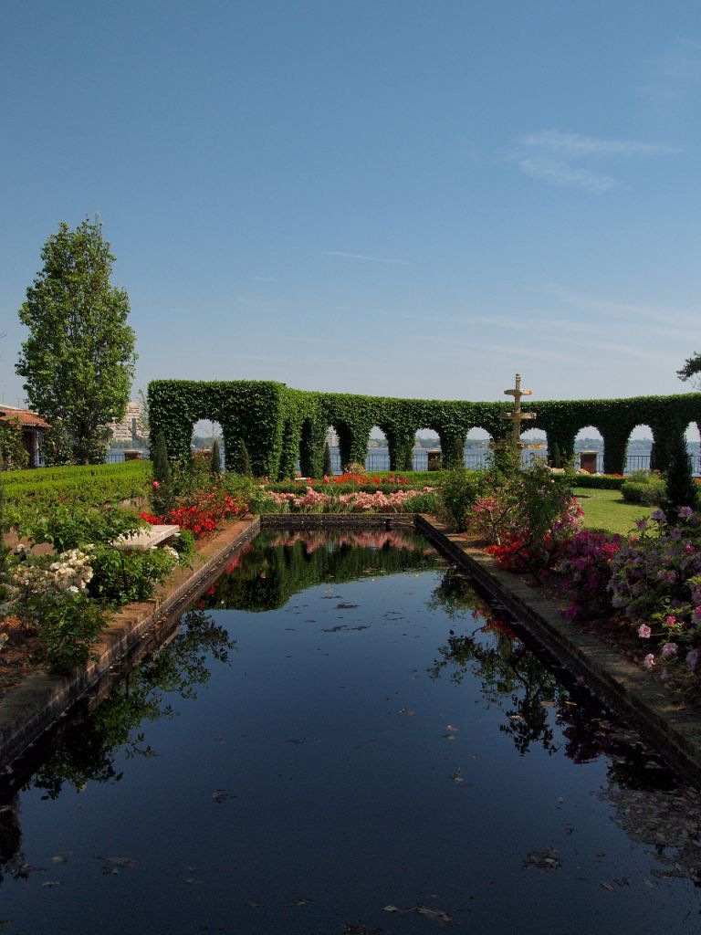
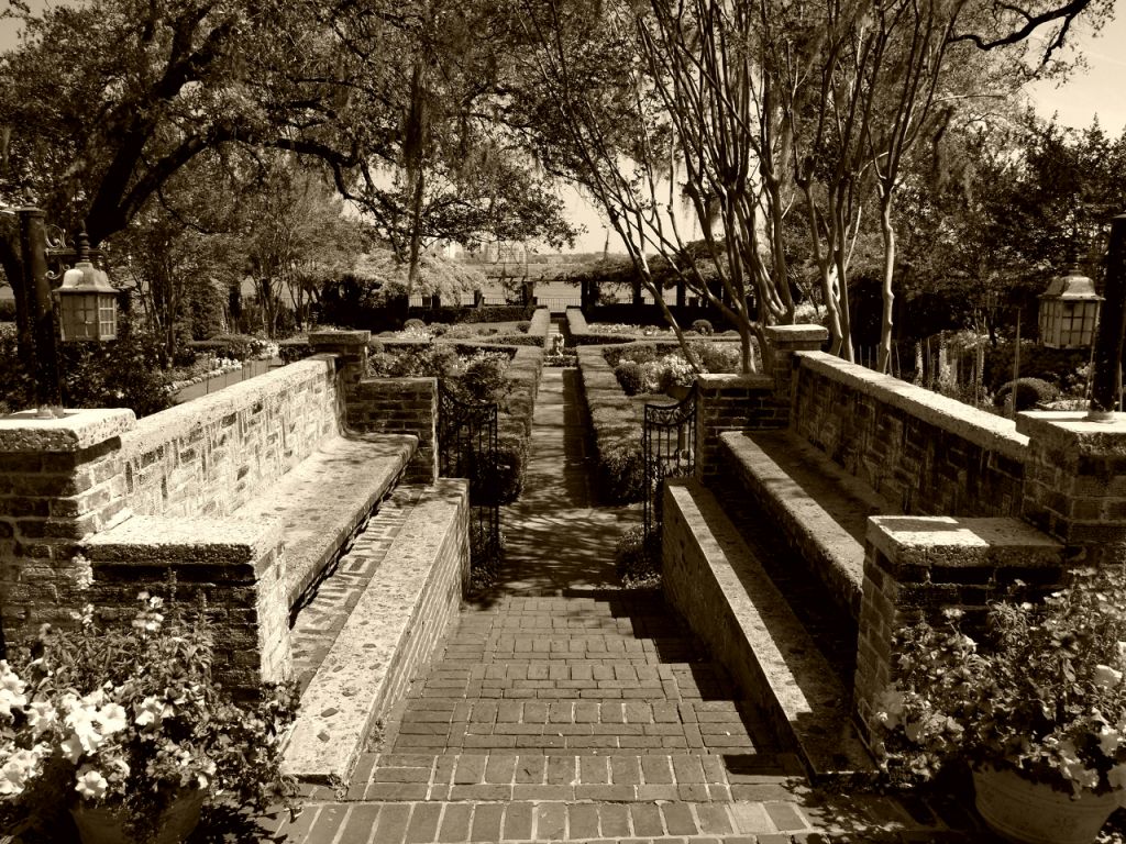
These two shots are similar, or I should say, their perspective is sorta similar.

At any rate, I processed both in Olympus Viewer from RAW. I don't normally do raw, but I thought I'd give it a shot. The first one isn't too much different than the OOC jpeg. Its a little sharper, but a little noiser. It has also been cropped a smidge.


The second one I thought needed to be B&W. No cropping.

I really wish the light had been a little better. It was about 1 or 2pm and their faint white clouds, blowing the sky out at times.

P3255719_crops.jpg


P3255640_scale.jpg
 
I like garden photography! I think the 2nd one is much better, your point of view really draws you into the photo. Top one has too much negative space and is too centered also the building on the left stands out too much. On the black and white you have great perspective, it's like you are really standing there and the warm tone is quite a nice touch. Mid day is not the best time to photograph but in B&W as you have shown it works better.
 
I think I'd like to see #2 in a wider 16:9 format, cropping out the angled row of bricks at the bottom and the remainder from the top. I feel that the top part of the image somehow distracts from the strong lines and symmetry at the bottom.
 
I thought both were fine, though I'd have liked both in colour. I can't think I'd have taken them any differently. I hope you don't mind but I've done a few bits of Photoshop work to show you what I would do with them. A bit of straightening, cloning and lightening to bring out the formality and symmetry, which was well captured.

P3255719_crops.jpg


P3255640_scale.jpg
 
Lisa,

Yeah, the sky adds some negative space. The orginal didn't have as much, but it had some dingy leaves that I didn't care for. Regarding the second, it really screamed B&W.

LuckyPenguin,

Are you talking about the crooked step up front? What I was standing on was actually like a round bricked pavilion, and that is where the round step ended, so that is why it is crooked. I might play with trying to remove it if it doesn't chop of the planters too much.

Thank you both.

I will post the original OOC jpegs of both:

P3255719.JPG


P3255640.JPG


This one I really love. I didn't post it originally because it is centered and thats something that is supposedly you don't do. But I felt there was no way else to shoot it. It felt like it needed to be centered.


P3255750wide.jpg
 
I thought both were fine, though I'd have liked both in colour. I can't think I'd have taken them any differently. I hope you don't mind but I've done a few bits of Photoshop work to show you what I would do with them. A bit of straightening, cloning and lightening to bring out the formality and symmetry, which was well captured.

View attachment 1206

View attachment 1207


You all move fast! I'm at work, so I try and get things done in between "work things", lol.

I have no problems with the images being "edited".


What exactly is "cloning".

On the second one, this does look better. My concern was chopping off the planters, but it seemed to work and still keep the weight in the corners.

Thank You,

Jason
 
What exactly is "cloning".
Copying one bit from another area and blending it in. Photoshop has a "clone tool" that does it. Its handy for both removing and adding things. I did actually add a little too much on the right side though, which I noticed after posting. A lot of it is done to make up for how lenses distort.

To be honest I really thought that your images were fine anyway.
 
Actually, David's bottom crop was exactly what I was thinking, and if the cloning can be made to look natural it fills in the gap at the top right which I felt unbalanced the image. I never really tend to get the results that I want when doing large-scale cloning like that, so I just crop :)
 
#2 is interesting, but I would prefer it shot lower down and facing straight ahead instead of tilted down. You could have done some interesting work with the shadows on the right side of the stairs. You could have also waited until the right side was fully in shadow and played off some sort of light / dark theme in the image, the path that walks the fine line...

#1 is uninteresting. In this case I would have tilted down more to put the end of the pond closer to the top of the image. And the random limb on the right... crop it out. There seem to be two schools of general thought about things on the edge of the frame. Frank Golhke would tell you to leave something just inside the frame that hints at there being lots more outside of the frame. But it still needs to fit into the overall theme and composition, and that limb does not. Others believe that a picture is better when everything is perfectly compositioned inside of the frame creating a sort of silo'ed lens into the picture. Both have their place.

Also in #1 you could have played a lot with reflections in the pond.

1-2 pm is a hard time of day to shoot.
 
Thanks for posting these. I have some thoughts, mostly on the first image, that I'd like to share with you.

First of all, I found this image slightly disconcerting at first glance. Clearly, the image reflects the symmetry of the garden but equally clearly the lower half (the pond) and the upper half (the hedging) are not symmetrical about the same axis. Your later post of the whole of the garden made clear why, but initially it threw me. Seeing the symmetry in the lower half, my brain wants to see it as well in the upper half and the lack of it is, as I say disconcerting. There's nothing much you can do about it (short of sneaking out at night with a spade and replanting the hedge:)), but on the other hand that little note of visual challenge is perhaps a good thing forcing the viewer to look again.

My own inclination would be to crop out a chunk of the bottom of the image. There is nothing going on in that large expanse of water in the foreground and I feel it distracts from the more visually interesting elements. I would crop so that the two edges of the pool intersect the bottom corners of the frame which would get rid of the empty space and provide a nice lead in to the frame. One potential downside of this is that you end up with a more or less square frame. If that's an issue you could also crop down from the top to just above the top of the tree which would give you something close to 4:3.

I think given the difficulty of the light at this time of day I would try to soften the contrast and boost the dark and shadow areas - I'm not sure if this can be done in the programme you are using. I'm using LR3 and these can all be tweaked individually in the Tone Curve panel.

The other thing I would do is work on the colours. The green is very dominant and it's getting most of the sun so I would be inclined to reduce the saturation and luminance on green/yellow just to ease the impact on the eye. I would also try to boost red/orange to bring up the colour of the flowers and the reflections in the pool. I would also boost the blue saturation a little to bring out the blueness of the sky reflected in the pool. Again, I'm not sure how possible this is in your software but in LR3 hue saturation and luminance can be individually tweaked in the HSL/Color/B&W panel.

I think this is a good example of a picture taken in difficult circumstances that can benefit from a little work in post processing to bring out the details that attracted you to the scene in the first place.

On the second one I have little to add but to say that I agree with Nic - I think you could crop out some of the foliage on top - and with Andrew that a lower perspective which maintained the sense of movement downward but enhanced the sense of movement forward might be interesting.

Here's another version of number one for you to consider that I did with LR. Let us know what you think.

5643119820_0a0153a1cc_o.jpg

http://www.flickr.com/photos/olliinmunich/5643119820/
 
olli,

One of the reasons I liked the image because of the play of assymetry and symmetry.

I do like the version you posted. I see what you mean as far as colors. Lots of green from the sunlight. I actually do have the raw file and I haven't had much of a chance to play with it since I originally posted this. I think your version maintains a better balance between the asymmetrical and symmetrical portions of the image.
 
Thanks Djarum - it's always a bit of a challenge working on someone else's image. If you do some more work on it please consider posting it here so we can have a look.
 
Back
Top